Main page

Friday, 22 October 2010

Storm Flipper


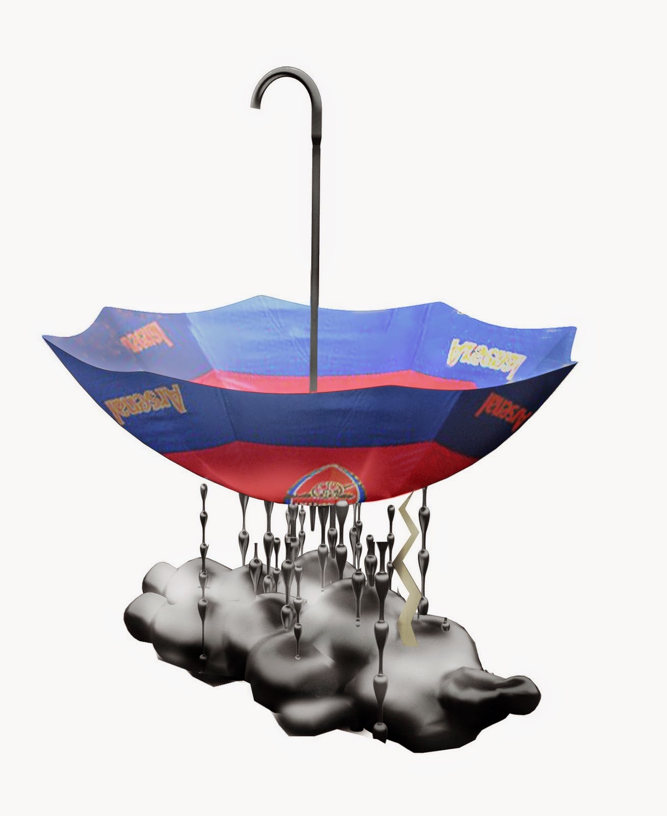
Competition entry for a new drinking fountain prototype in the parks of London.


The concept is quite simple; an image of bad weather is turned upside down and creates a very strong icon for a drinking fountain.


The overturned umbrella acts as the water basin, the raindrops as its structural support as well as water pipes and the cloud as its base.
A lightning coming from the cloud lights up during the night.
Rainy weather is a very suitable symbol for both a drinking fountain and the city of London and will surely attract many thirsty park visitors
around the city to quench their thirst.

Construction
Vertical metal pipes with drops mounted on them are holding the structure. The dimension of the pipes is changing depending on function, making the outer ones constructive pipes and also the water pipe is a bit thicker due to factors as vandalism. The sink is made of plastic that is later painted in various combinations. The base is cast and polished concrete with drilled holes for assembling the pipes underneath the base.
Materials can be altered after consultation depending on cost and durability.


There are an endless assortment of patterns and colours for umbrellas and no matter how they look they are still unmistakable recognized as umbrellas. The drinking fountains can therefore be carried out in a great variety as well, without losing its familiarity as an object.
The different styles can be chosen according to the various parks location and image and the result will be a great number of different drinking fountains that comes from the same module.
The bad weather module can also be done in a divided edition and can thus be wall mounted. There is also the possibility to sponsor some of the modules, just like corporate umbrellas.
Many thanks to our Colombian friend Andres Morelli for the renders.


Wednesday, 13 October 2010

Noah's House

A client wanted help to build a small summer house inside of an old shed at an island in the northern Stockholm archipelago. The shed is just next to the Baltic Sea and has been exposed to overflows every tenth year or so. Knowing that the house probably will be hit by another overflow and the fact that we were only allowed to build inside the shed forced a specific design.

To build a totally waterproof house would be too expensive, so this house is constructed as a lizard’s tail. If one part of the building gets exposed to water that particular part can easily be replaced without affecting the rest of the building.
The whole building is constructed by spruce boards and spruce pillars and with no synthetic materials in its lower regions. The horizontal spruce boards can be taken away when exposed to water to dry and later be put back or be replaced by new ones. The house is insulated like a hat to not be affected by an overflow. The electric parts of the house are also put in the higher regions of the house and will not be affected by an extreme overflow.
Since the client mostly spends his time there during the summer, we also had to come up with a warning system if the water levels have been reaching the construction underneath the floor and need to be ventilated during overflow season, which is usually at spring time. The warning system became a rising totem pole where the face changes its mood depending on how high the water level has reached underneath the house.

 Since the shed was too slanted we could not rely on its structure and had to build a totally new house inside. To get as much space as possible we tried to build as close as possible to the old structure, giving the floor plan a long niche along one of the walls where we decided to put a battery of functions. The battery consists of a small kitchenette, a storage space and an expandable bunk bed which is all constructed out of spruce boards as well. One positive outcome of that is that you have the best view in the house from the bed so you can fall asleep watching the bay’s midsummer sunset. The only change to the existing façade is the big window and a wooden terrace with a outhouse on it towards the see and a new entrance door, hardly exposing the building’s new function which gives a pleasant surprise for visitors.


 Plan
 Section with an overflow chart
 Function battery drawing

We did not design what furniture that would be put into the house but since the house will be occupied by lots of people with a sailing and surf interest we made a back wall filled with wooden hangers. Since a lot of the stuff that will be hanging on that wall will have sail and surf aesthetics
We made wall lamps using Nixon masks “Point Break” style to match all of those gadgets.

 Assembly of the overflow warning system                                                                                                                                                                                                         Carving the totem pole

Thursday, 2 September 2010

Hollow

Competition entry for Sukkah City, where one where asked to design a modern sukkah.
A sukkah is a temporary hut created for an annual jewish harvest festival.
A large number of design constraints where implied in the competition, for example the sukkah had to have a roof made out of branches, but they couldn't be in bundles, there of our construction technique, using compression.

As this sukkah is erected in one of the most populated and dense places on Earth filled with built structures and a stressful ambience it changes its function from its initial protection purpose from sandy winds and a blazing sun to a shelter from building mass, infrastructure, scale, city pace and constant movement.
The intention is to build something that differs in scale and pace from the rest of the city. When entering the sukkah, you automatically slow your pace and behaviour and switches to a resting position due to the physical restrictions that makes up the space.
An undulated ceiling, never higher than a man’s length, changes the conditions for social interaction and behaviour.
You are no longer able to perform as you are used to under normal circumstances, your strength and speed is reduced and you are no longer a potential physical threat to your surroundings. The different heights and thickness of the roof sets the atmosphere.
The hollow reed changes its light and visible permeability by how thick it is.

The space itself comprises of two interlinked rooms; a social area for dining and interactions and a more closed space for sleeping and star gazing


 Building manual;
1. Material needed;
Hollow reeds, saw, lopper, wooden planks
 2 The planks are cut up so they will form an interlocking adjustable frame which will hold the reeds in place.
 3. The reeds are kept in an upright position with one of the planks and are adjusted back as the amount of reed is added.
 4. The construction is watered with a mix of potato starch and water, making the reed swell and the wood frame expand a bit, thus making the construction more stable.
The potato starch makes the reed a bit more sticky and holds everything together better.
 5. The trimming of the reed can begin.
Space is cut out according to the plan and the light intake can be adjustable by cutting the reeds shorter on top of the structure.
 Plan
 Roof plan

Wednesday, 1 September 2010

Narva Paviljongen

A project made with Svensk Standard, for more info, credits, Wiki info and a movie go to svenskstandard.org.
A small sign produced during the summer of 2009 (as a part of the work “en annan paviljong” by Anna Koch, Weld) for a pavilion in the park Tantolunden, in Stockholm. Telling the fake story of the pavilions spectacular past.
Even thought the story was way to good to be true, the sign was kept and care taken by the Stockholm municipality for over four years. Then some one curious asked the Swedish news paper DN about the content of the sign and the scam got discovered and the sign got removed.
The fake story with fake pictures of the pavilion in great Swedish paintings.
The sign after one year standing in the park


Tuesday, 31 August 2010

Hill Hut


A commission to design an extension to a villa for two kids in a picturesque lake setting in southern Stockholm. The owner of the old house had met his new wife in Thailand and the couple wanted to move and settle down in Sweden along with her two children. The beautiful nature surrounding the plot and the fact that the house would be occupied by two kids became the main key to the design. Instead of designing a house with expensive materials and detailing we deliberately chose rather cheap windows, facade materials and so on, thus allowing a bigger budget for a more playful architecture. It is much cheaper to get something wonderful done with landscaping than traditional architecture so we made a landscape surface with enhanced elements around and inside the house for the kids to thrive in. Being a kid in Sweden means that you naturally spend a lot of time in the nature which our country have an abundance of and we wanted to give the two new citizens a safe base where they can explore their new surroundings and be able to appreciate it to the fullest.


 To be able to create a steady foundation for the new house, huge earth masses where to be taken away and used to create a hill which we enhanced with different elements such as an outdoor cinema and a sledge slope. A carpet of artificial grass connects seamlessly with the natural grass on the hill and enters via the terrace to the living room between the two children’s room. A custom made grass sofa, a couple of grassy knolls that also functions as lighting make the interior more organic and enhancing the nature experience even further. These artificial hills can be moved around and can be put outside as well. Two pairs of big glass doors on both sides of the room makes one fully take in the surroundings and creates the impression that the nature goes in to the house, this effect is even more apparent when the doors are fully open. The carpet of artificial grass continues out on the other terrace as well as to the hallway and makes a stop just before the old house.

The excavations left a big void under the house. By ordering all the windows from Poland instead of Sweden we could afford to do two secret caves in that void. The caves were made out of concrete with in-cast IKEA drinking glass as small lanterns. One cave is directed to a lush grass knoll that leads down to the lake and is disguised with artificial grass to blend in. The other cave is pointed towards a patch of forest and is left in its raw concrete. Besides from being an excellent hidden escape route, the caves can be equipped with poker tables, hold new found pets from the nearby forest and much more. The caves are accessible from both the outside and from the children’s room by hatches in the floor.

The outdoor cinema has six chairs that are inserted in a concrete foundation in the sloping hill along with a secret compartment for a microwave for snacks and popcorn and a projector. A screen is set up between two trees that also have two bird houses on its trunks which in fact are two disguised speakers for this small outdoor cinema. At daytime this is a perfect place to just take in the lake atmosphere and observing bird behavior, night time is movie time.

The entrance to the new house is a removed window from the oriel and makes the old house inserted in the new building and shapes the walls of the children room next to it.
The hallway that leads to the old house slopes because of the differences in heights of the two houses and makes a nice transition from the traditional Swedish house down to the new and playful one. The children’s rooms are almost as two separate units with the landscape between and around them. Except for the hatches in the floor, the children’s rooms are quite normal with wooden floors and white walls.The house itself follows the municipality’s different regulations such as the pointed roof and the appearance. Wood is the predominantly material in this region, like the existing house and the neighbors. We chose white corrugated metal sheeting that looks like wood from a distance but is more alive and reflecting as one comes closer and gets nice shadow effects from the surrounding trees. Choosing metal sheets also allowed us to have the walls and the roof in the same material which creates a very consistent building. The beautiful setting and the strict whitish house combined with the eccentric landscaping makes it a great place to grow up in.

Hallway
Hatch to cave


Inside the cave

Outdoor cinema

South-west facade

Facade facing the lake 

Facade facing the entrance - late autumn

West facade - winter 

Front terrace

Outside one of the caves

Axonometry of the landscape

Section

Section

Plan

Details

Diagram of movement

Fake vs natural diagram